Barclays - Fair & Square
Barclays
Category
Techniques
Director & Agency
Not To Scale continue their creative relationship with BBH London in a rich vein of form, with some deftly crafted graphic spots for BBH and Fair and Square, the short lived open and transparent bank from barcalys.
Fair & Square
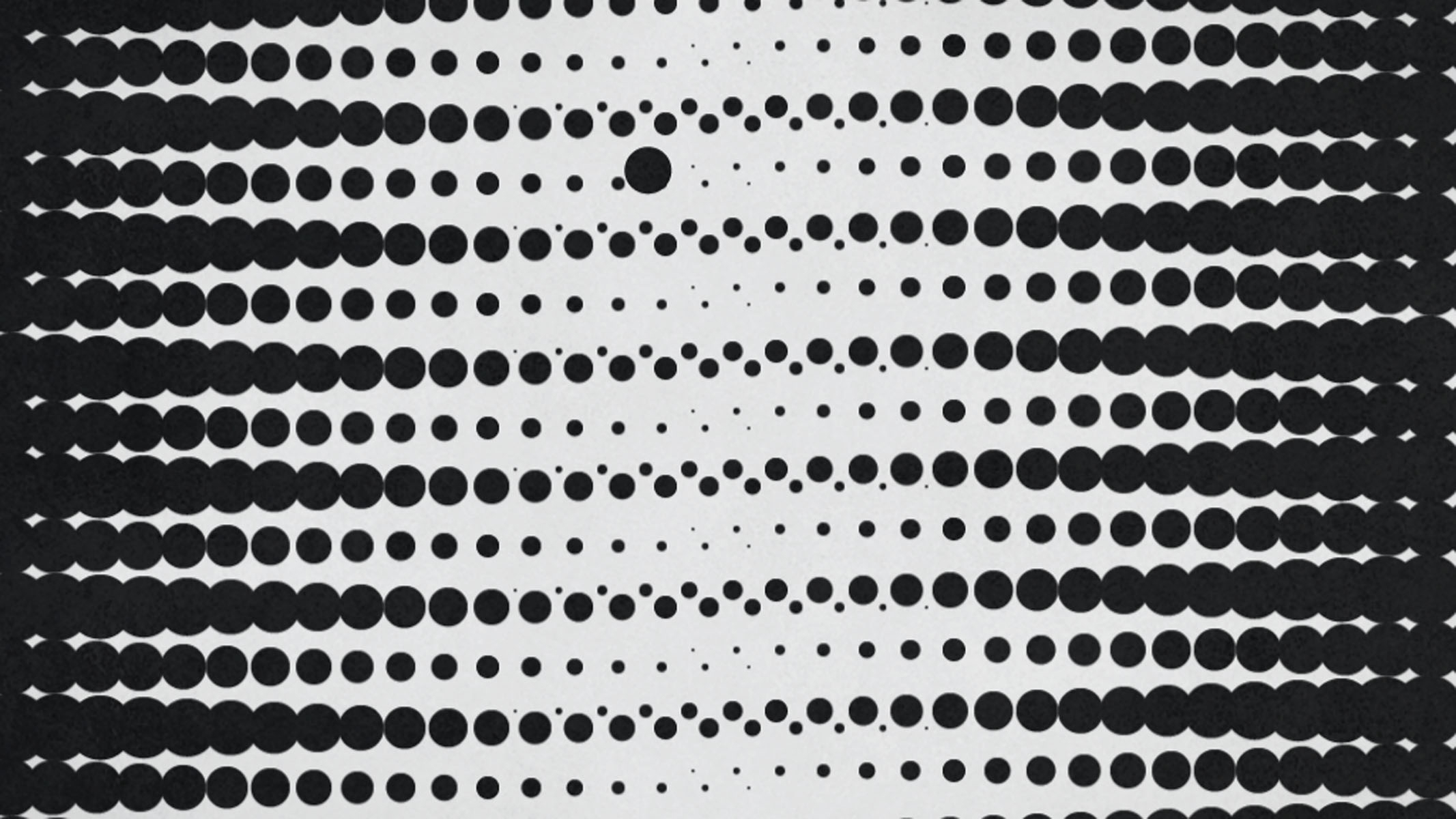
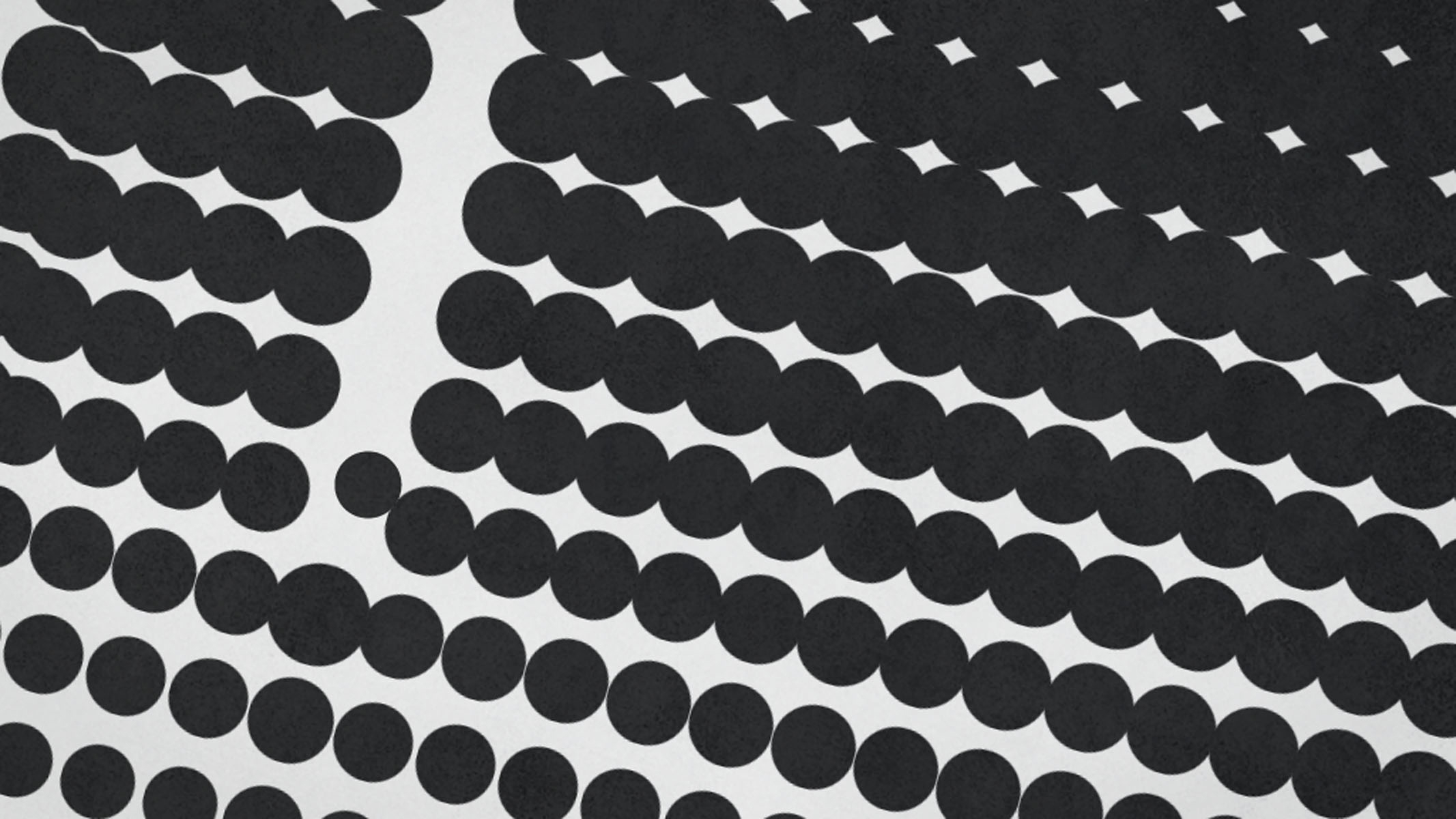
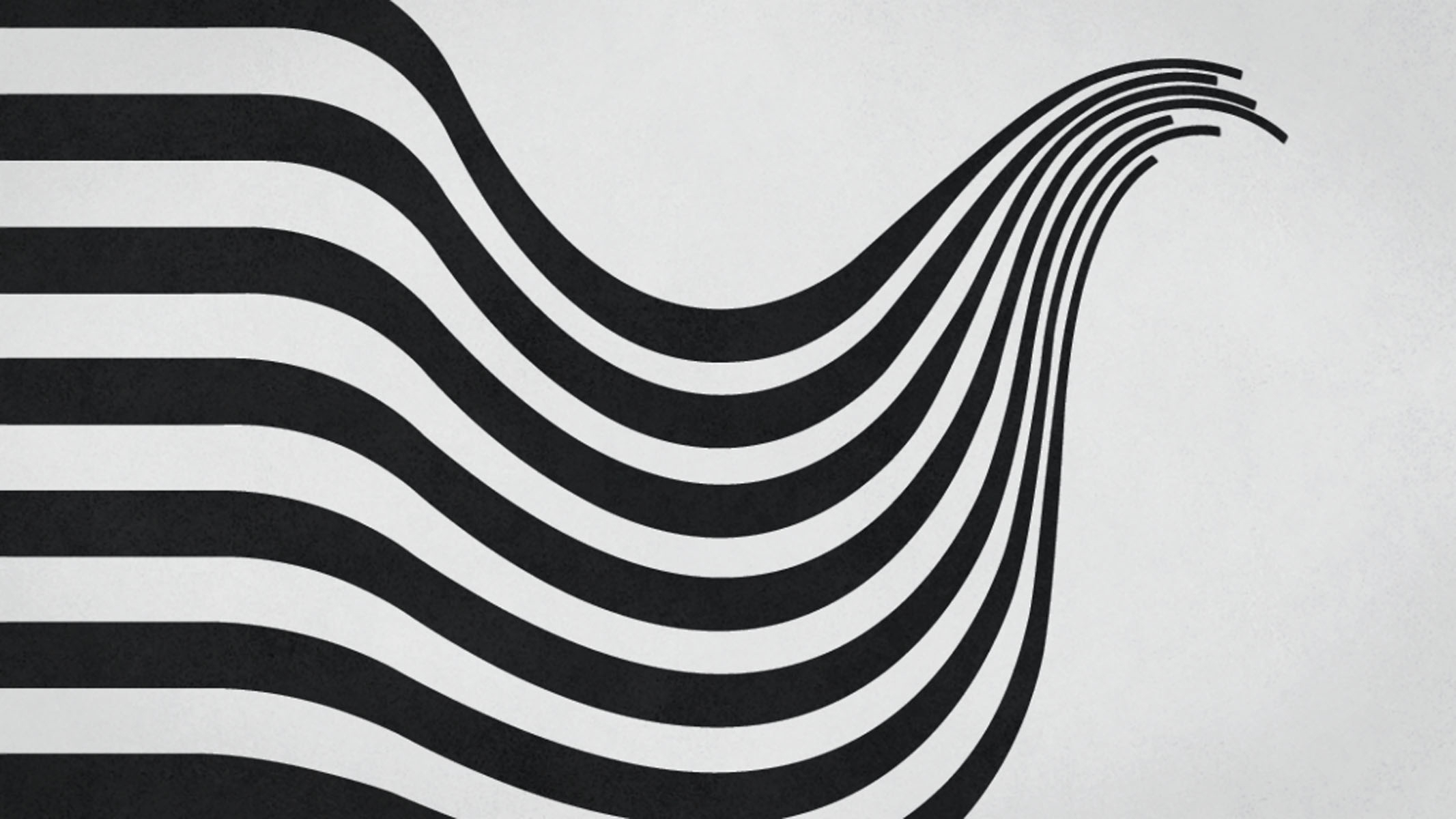
After a heavy pre-production phase that continued through various rounds of conceptingdesigning and devising different storyboard options. The team settled on boards for‘Dots’ and ‘Pattern’ as the two ‘Fair & Square’ launch films. The campaign which waspart concepted by National Televison, is solely made up of 2D monochromatic,geometric, asymmetrical animation. Before you reach for the Maths book, that equates totwo stunningly simple and effective black and white films.


